- Format-3
- Curiosity
- Perspective
- The Experience Edge
The Experience Edge


Share article
The iGaming industry has spent years making its products bigger.
More games, more markets, more payment options, more data and more features. But after working with thirteen casino and sportsbook brands across different markets, platforms and technology stacks, we kept seeing the same thing: the hardest part is already built. The bigger opportunity now sits in the experience around it.
Over the past few years, Format-3 has worked with thirteen iGaming brands on UX reviews, competitor benchmarks and optimisation roadmaps. Some were casinos, some sportsbooks and some hybrids. Some operated on white-label platforms, while others ran their own technology. Many operated in fast-moving, crypto-first markets where competition is relentless.
Every engagement started from a similar position. The product was already substantial. There were deep game catalogues, competitive odds, live statistics, cash-out, favourites, bet generators and other features that showed serious product thinking. What varied was how easily players could actually access and understand all of that functionality.
That distinction matters. Breadth is expensive and slow to build. Experience is much faster to improve. When most serious operators already have thousands of games and hundreds of betting markets, adding another feature does not necessarily create a meaningful advantage. Making the existing product easier to discover, understand, trust and use can.
This is the pattern we found across the work: the product itself was rarely the constraint. The biggest opportunities were concentrated around clarity, trust and speed.
The cost of a product that keeps growing
Navigation was one of the clearest examples. Fast-growing platforms naturally accumulate ways of getting around them. A top bar gets added here, a tab row there, followed by a side rail, hamburger menu, overflow menu or bottom navigation. Over time, different parts of the product develop their own structures, while mobile, desktop, logged-in and logged-out experiences can all start behaving differently.
The result is not necessarily a broken interface. It is something more subtle: a product that asks players to repeatedly figure out where things are.
For operators with both sportsbook and casino experiences, this becomes particularly visible. Each side of the product can evolve its own hierarchy, despite being part of the same platform.
A more consistent structure can unlock a surprising amount of value. One global navigation, clear destinations, permanently visible search and a bet slip that becomes prominent when a selection is made can make the rest of the product easier to understand. It also creates more room for the content that actually matters.
The principle is simple: players should learn the structure once and be able to use it everywhere.
That becomes even more important on mobile. More than 70% of sports betting traffic arrives on mobile, according to the benchmark data used in our work, so the mobile experience cannot simply be a smaller version of desktop. Touch targets, hierarchy, navigation and access to core actions all need to reflect how the product is actually being used.
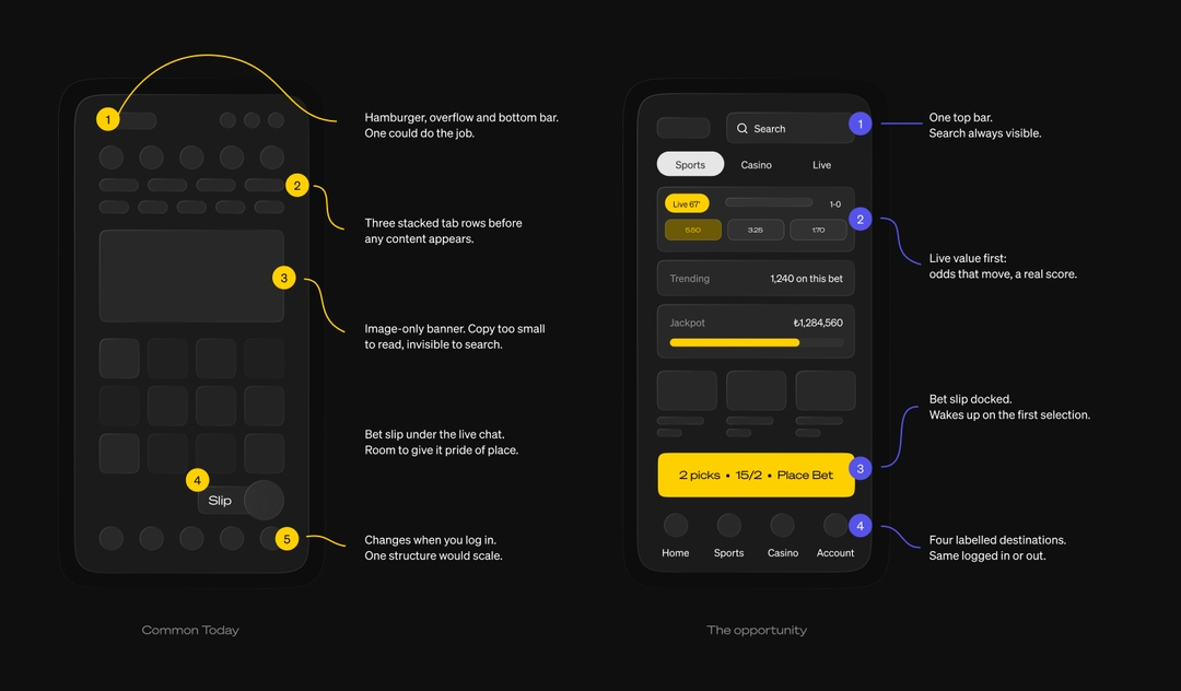
Your homepage should show that the product is alive
The same problem appears on the homepage.
Many of the homepages we reviewed relied heavily on promotional artwork. It can look polished, but a static banner cannot communicate one of the strongest qualities of betting and gaming: things are happening all the time.
Odds move. Matches start. Jackpots change. People place bets. Games become popular. Markets develop.
That gives iGaming something most digital products do not have: a naturally dynamic product story.
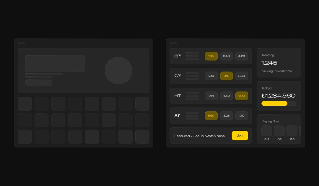
The homepage can use that to its advantage. Instead of relying primarily on promotional content, it can immediately surface live odds, featured markets, trending bets, growing jackpots and what people are playing right now.
Several of the platforms we reviewed already had components capable of doing this. The opportunity was often much simpler than building something new: move the useful information to where people can see it.
The distinction is between a homepage that advertises the product and one that demonstrates it.
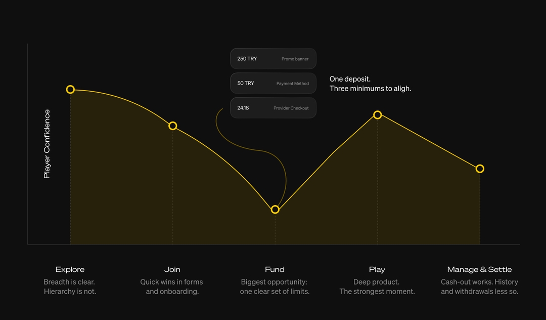
The biggest opportunities appear where confidence drops
When we mapped the player journey, another pattern emerged. Confidence was generally strongest once players were browsing and playing. The larger opportunities appeared around joining and funding, which also happen to be some of the moments closest to revenue.
Registration is often treated as a necessary administrative step. It does not need to feel that way.
There are straightforward improvements available: remove unnecessary usernames, use email where appropriate, autofill information where possible and log players in immediately after registration. Instead of presenting an account wall, the experience can make the next step feel like a continuation of the journey.
Onboarding provides another opportunity. A short welcome flow can capture preferences, introduce limits and present an initial reward while the player's intent is still high.
Then comes the deposit.
This is where the relationship between UX and trust becomes particularly clear. Many of the partners we worked with operate in crypto-first environments, which can provide flexibility but also introduces additional information for the player to understand. Fiat amount, crypto amount, exchange rate, network, fees and expected balance can all become part of the same transaction.
When those numbers appear in different places or use inconsistent minimums, uncertainty increases. In one journey we reviewed, the promotional amount, payment method minimum and provider checkout minimum were all different.
The solution is not necessarily another feature. It is clarity: one source of truth for the transaction, explicit verification requirements and a guided first deposit.
If the path to money is clear, everything that follows has a stronger foundation.
Speed is part of the product
Performance was another recurring opportunity, and one of the more measurable ones.
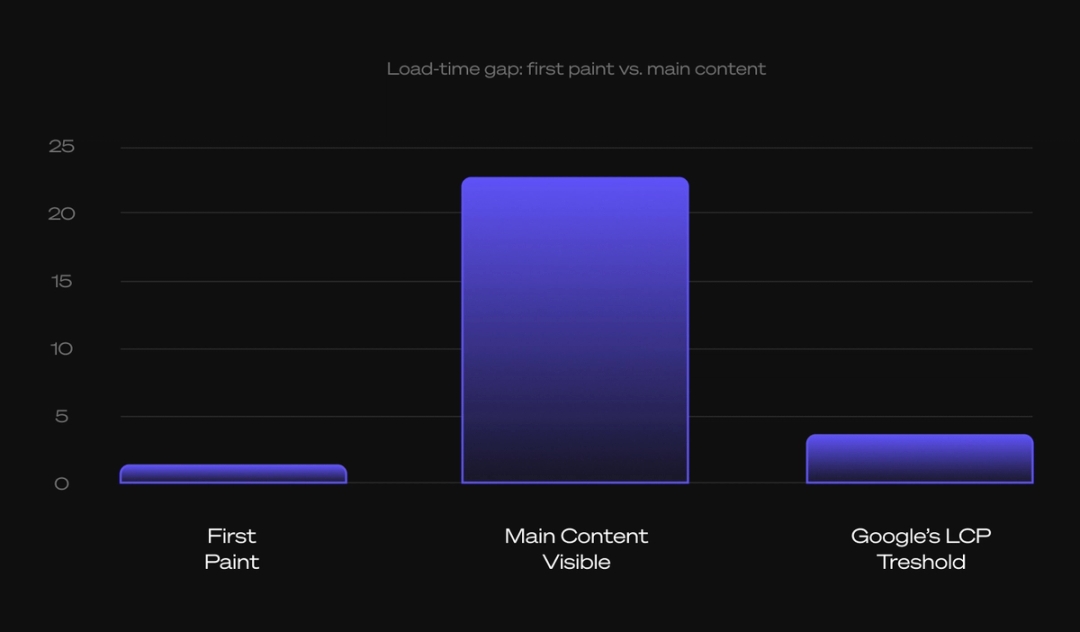
In one engagement, the first paint arrived in 0.9 seconds, while the main content took 22.6 seconds to appear. Around 1.5MB of JavaScript was flagged as unused. Elsewhere, iframe-heavy game integrations were taking four to six seconds to load.
For a live betting product, these numbers are not simply technical measurements. They affect the experience at exactly the moment when timing matters.
Google's threshold for a good Largest Contentful Paint is 2.5 seconds. The further an experience moves beyond that point, the more time a player spends waiting rather than interacting. In live betting, that can mean waiting through a change in odds or a match event.
There are practical ways to recover some of that time: trimming and splitting JavaScript, optimising images, deferring third-party tags, replacing full-screen loaders with skeleton states and reviewing iframe architecture with the platform provider.
The important shift is to stop treating performance as something that belongs exclusively to engineering.
A fast experience is a product advantage.
Accessibility improves the experience for everyone
Accessibility appeared in every review, and the improvements were remarkably consistent. Stronger contrast, labels alongside icons, visible focus states, pinch-to-zoom, useful alt text, descriptive buttons and clearer geo-block messages all make the product easier to use.
The same applies to localisation. In multilingual markets, switching language halfway through a journey, including in security or payment messages, creates unnecessary uncertainty.
None of these improvements are particularly exotic. They are simply good interface design.
That is why accessibility should not be considered only as a compliance exercise. Clear contrast, meaningful labels and plain language can reduce errors, make journeys faster and lower the amount of support a product requires. The audit describes the resulting opportunity directly: accessibility and localisation are conversion work because they remove friction from the same journeys everyone else is trying to complete.
Trust is built in the small moments
Social proof is another area where details matter more than technology.
A win feed can demonstrate that people are playing. A trending bet can show what others are backing. But the proof needs to feel authentic.
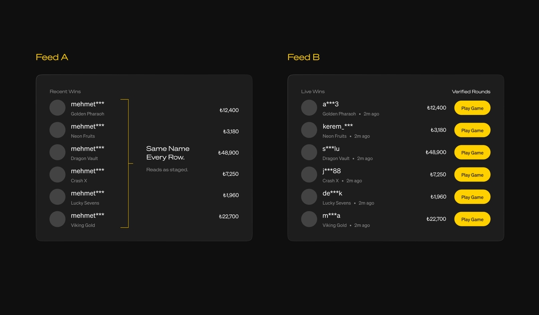
We saw examples where the same name appeared repeatedly and every row followed exactly the same structure. The result was technically functional but visually repetitive enough to feel staged.
Adding variation changes the perception: different names, timestamps, the game involved and a clear action to continue. These are small details, but they make the information feel more like something happening inside a real platform.
The same principle applies when things go wrong.
A blocked selection, empty state or pending transaction is not simply an error state. It is an opportunity to demonstrate that the product understands what happened and knows what to do next.
Explain the problem. Preserve the player's context. Provide a clear next action.
Trust is rarely created by a single large feature. It is accumulated through hundreds of small interactions.
Hardy Sidhu
The gap is smaller than it looks
One of our latest engagements put this into numbers.
We scored a partner against twelve market leaders using eight equally weighted themes, each scored from one to five. The benchmark mean was 4.31, while the partner started at 2.94, creating 1.37 points of headroom. The important finding was not simply the size of the gap, but where it existed. Proposition, core product and promotions were already relatively strong. Most of the opportunity was concentrated in wallet and transactions, trust and user control, and registration and onboarding.
That pattern changes how a roadmap can be approached.
If the product is already close to the benchmark in its core functionality, rebuilding everything is unlikely to be the most productive answer. The opportunity is to identify the journeys where friction is concentrated and improve those first.
Focused journeys make focused roadmaps.
And focused roadmaps make it possible to move faster.
Build the foundations before the next big thing
There is an understandable temptation in iGaming to look immediately towards the next generation of features: real-time experiences, social betting, micro-betting, missions, streaks and AI-assisted bet building.
We explored many of these ideas with our partners. In one prototype, an AI assistant could take a natural-language request such as building a $5 accumulator with a target return and turn it into a live bet slip in seconds.
These are the kinds of experiences that can define the next generation of platforms.
But they work best when the foundations underneath them are already strong.
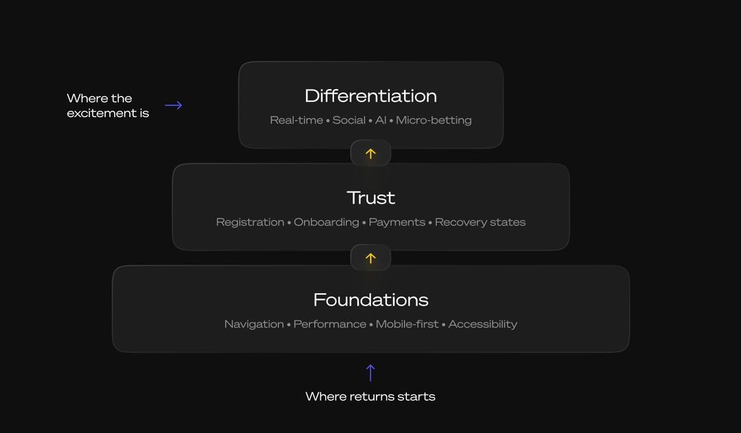
Across our roadmaps, the sequence was consistent. First came foundations: navigation, performance, mobile-first layouts and accessibility. Then trust: registration, onboarding, payments and recovery states. Only then came differentiation through real-time, social, AI and micro-betting.
The logic is straightforward. A sophisticated feature on top of a slow or confusing product is still a frustrating experience. The same feature on a platform that is fast, clear and trustworthy has much more room to become a genuine differentiator.
There is also another layer to this.
As engagement features become more sophisticated, responsible-gaming tools should become part of the same experience rather than remaining buried inside account settings. Limits, spend information, session time and reality checks can be surfaced where decisions are being made.
The next generation of products needs both the hook and the handrail.
The experience is the next competitive layer
After thirteen partnerships, the pattern is difficult to ignore.
The category has already invested heavily in product depth. The next opportunity is to make that depth easier to access and easier to trust.
That means simplifying navigation rather than continually adding new entry points. It means making the homepage demonstrate what is happening instead of relying entirely on static promotion. It means treating registration and payments as product experiences rather than administrative steps. It means measuring performance as part of the commercial experience, not just the technical one.
And it means paying attention to the moments that are easy to dismiss: an empty state, a failed payment, an unclear label, an inconsistent number, a loading screen, a confusing error.
Most of the work is not glamorous. It does not require another revolutionary feature or a complete rebuild.
It requires understanding where the experience is creating unnecessary friction and removing it.
The product is already there. The next edge is the experience.
Hardy Sidhu

More thoughts
Thought leadership creates value, builds knowledge and takes a stand, bridging the gap between traditional and digital platforms

Agent-first brands: Adapting for AI-driven discovery
Discover how agent-first brand strategy is reshaping discovery in technology, healthcare, and entertainment as AI agents become the gatekeepers of purchase decisions.

Driving Growth with Attention, Transparency, and Friction
Discover how our approach helps the team thrive and deliver impactful work.
SayHello!
- 21:24:34NashvilleUSA
- 22:24:34New YorkUSA
- 03:24:34LondonUK
- 04:24:34KatowicePoland
- 04:24:34BratislavaSlovakia
- 05:24:34PlovdivBulgaria
- 06:24:34DubaiUAE