
Overview
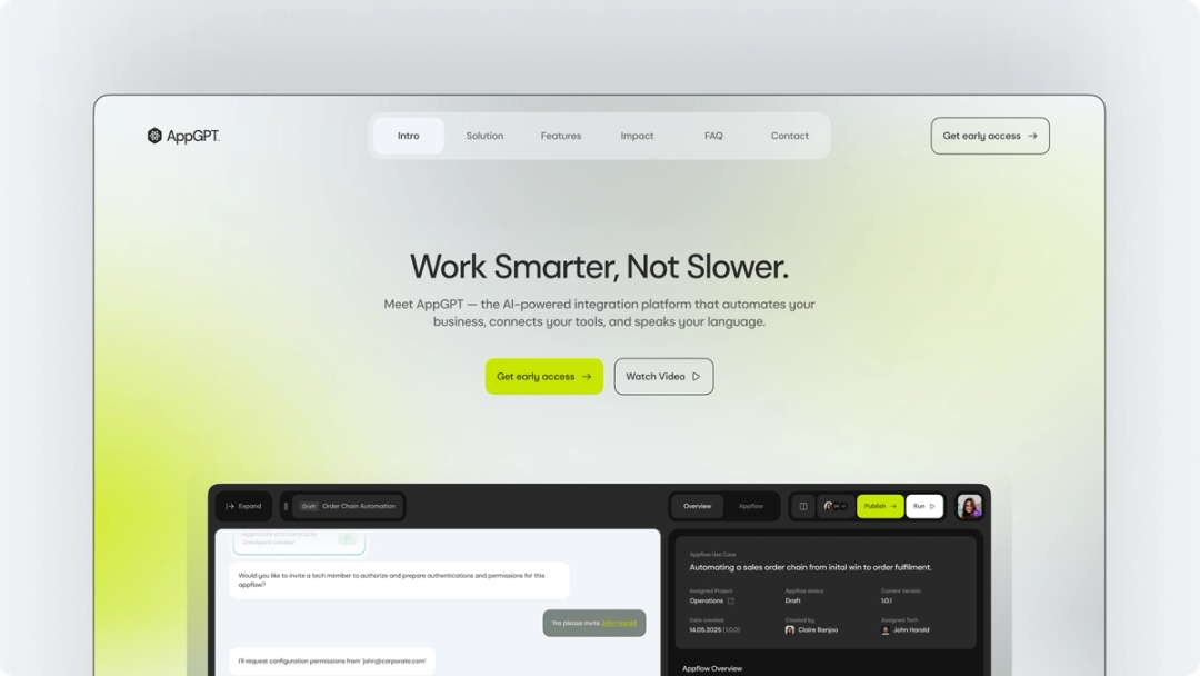
Machine Two approached us to define and design AppGPT, a next-generation AI integration platform. We led product strategy, experience design and positioning, turning deep technical complexity into a scalable, language-first automation product built for real-world use.
From Client
We brought Format-3 in to build the design system and design language for our new brand and product platform. They delivered the full thing — components, iconography, a complete visual language. Friendly, professional, on time, and the kind of work that's going to lift our brand consistency the moment we ship it. Excellent company to engage with.
Ranjit Gahir
COO

Phase One
Product Discovery
Before defining what AppGPT should become, we needed to understand what it truly was.
Through in-house workshops and deep stakeholder conversations with leadership and engineering, we unpacked the ambition behind the platform, the technical realities shaping it, and the friction points limiting its potential.

Phase Two
Experience and
Concept Development
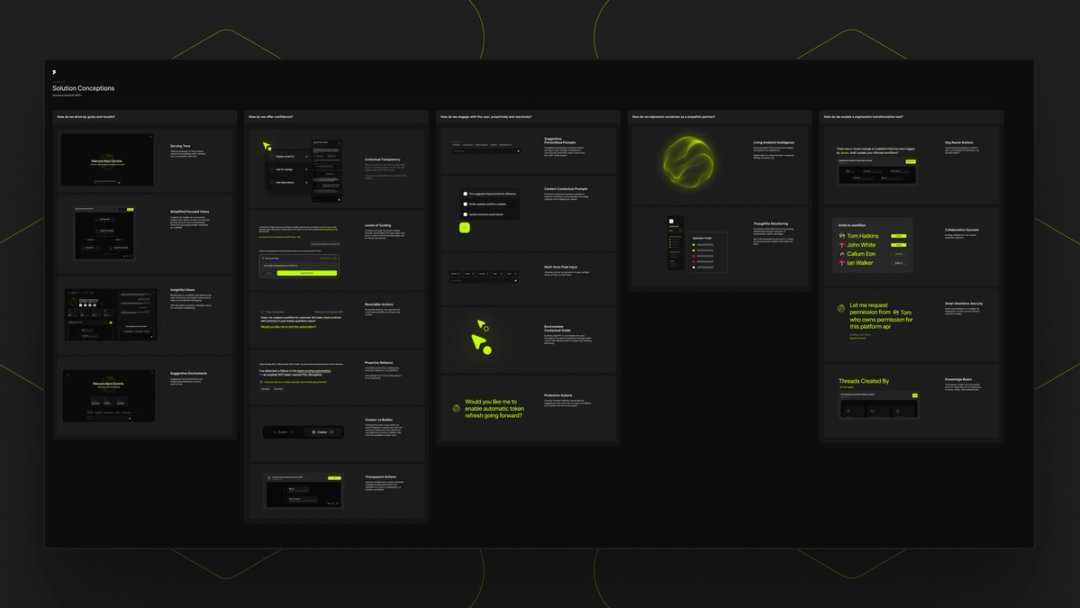
Strongly focused on shaping how AppGPT should think, respond, and guide users through complexity, we audited the existing product journey, analysed competitive interaction models, and pressure-tested assumptions through structured “warboard” sessions, identifying where traditional automation patterns were limiting clarity and speed.
From there, we moved into macro concepting, defining the core behavioural model of the platform. Instead of designing screens, we designed decision flows. Instead of building dashboards first, we designed conversation logic.

Phase Three
Brand Identity & Expression
With product logic and interaction architecture defined, we shaped how AppGPT should show up in the world.
The goal was not to “design a logo,” but to build a coherent identity system that reflected intelligence, modularity, and control within complexity.
We developed the AppGPT masterbrand by creating the Tera symbol — enclosed within a structured hexagon — with the AppGPT wordmark. The Tera sign became a central visual connector across all expressions, reinforcing the idea of connected systems and guided orchestration.
Phase Four
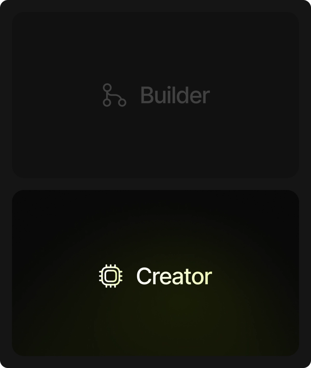
Product & Interface System
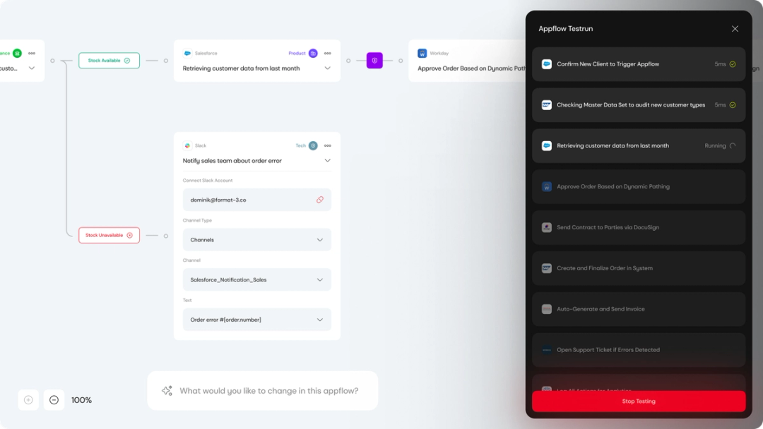
We moved to develop the visual language, refine brand elements within the interface, and built a scalable component architecture designed for complex automation environments. The focus was clarity under pressure — ensuring workflows, dashboards, and system states remained understandable even as operational complexity increased.


Phase Five
Motion & Interaction Intelligence
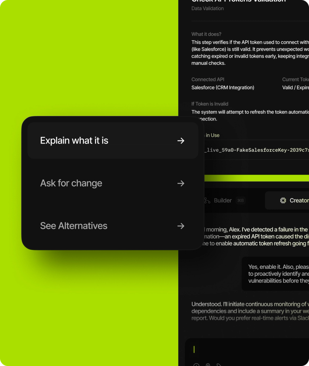
In this phase, we designed the behavioral layer of the product, defining how the system communicates state, progress, and intelligence. Motion was used to signal transitions, confirm actions, surface errors, and reinforce conversational flow.
Micro-interactions were crafted to reduce uncertainty, especially within multi-step automation processes. Instead of decorative animation, motion became functional feedback, helping users understand what the system is doing, why it’s doing it, and what happens next.


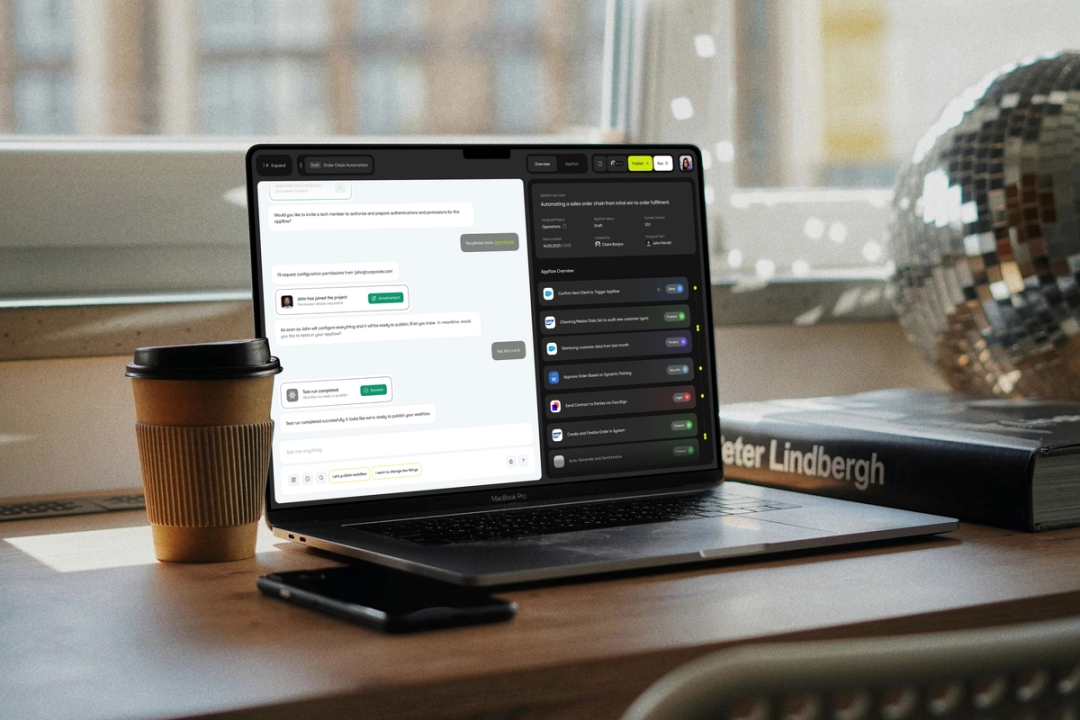
Recent work


SayHello!
- 16:20:32NashvilleUSA
- 17:20:32New YorkUSA
- 22:20:32LondonUK
- 23:20:32KatowicePoland
- 23:20:32BratislavaSlovakia
- 24:20:32PlovdivBulgaria
- 01:20:32DubaiUAE